A team led by RWDI and including the Ontario Association of Architects (OAA) and Toronto’s Architect 2030 District have developed Compass, a game-changing energy benchmarking tool – set to launch in Fall 2018.
The Energy Compass tool streamlines energy benchmarking and reporting during the design phase of building development projects. The tool enables users to upload energy models (eQuest, EnergyPlus, or IES-VE) and then automatically extracts over 400 building variables and completes the submission requirements for six building standards and programs (LEED, TGS, OBC SB-10, 2030 Challenge, TGS and HPNTC) in a matter of seconds. A data visualization platform allows users to benchmark their modelled building against a database, which in turn, informs the design process pushing buildings to ever higher levels of performance.
In the past, the information contained in energy simulation files has not been leveraged to analyze performance trends or benchmark like buildings to improve performance. Compass is designed to enhance the quality of modelled energy performance, improve the energy literacy of the design and construction community, improve conservation program delivery, and ultimately reduce energy use and greenhouse gas emissions from every proposed building development in Ontario.
In 2017, TAF provided technical development funding to enable the first phase of the larger project. The primary outcomes of this phase of the project included a robust matrix of energy model variables that identifies over 400 key building characteristics – from window-to-wall ratios to heating plant efficiencies. Initial scripting began to harvest these characteristics from energy modelling software to auto populate submission requirements. Leveraging the above technical development, the project team made a successful application to the IESO’s Conservation Fund to enable the development of the remainder of the project. In late 2017, IESO funding was awarded to complete scripting and the development of a user interface, security and data protocols, and to lead adoption and dissemination activities over the next two years.
In early 2018 the development team put the tool through a beta test, in total, 16 individuals from a diverse array of 9 architecture, engineering and energy consulting firms participated. The beta test period exceeded participation expectations, seeing 65 energy models uploaded to the tool.
Based on feedback received, the tool’s greatest strength is its ease of use and ability to automatically extract variables, in seconds, from complex files that could otherwise only be interpreted by skilled professionals.
Once users have uploaded at least one project, they can begin to see how their portfolio of work compares to the industry at large, using a set of data visualizations.
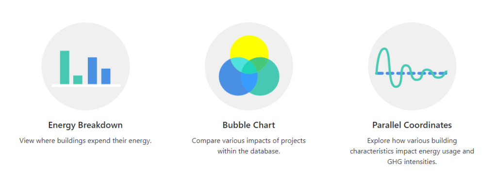
Energy Breakdown Bar Graph
This graph enables the comparison of energy use across the Compass database. Projects that were uploaded by the user and other members of their firm are shown using opaque colours, with full display of the details. Projects uploaded by others outside of the user’s firm are given a transparent shading, and only limited information is displayed.
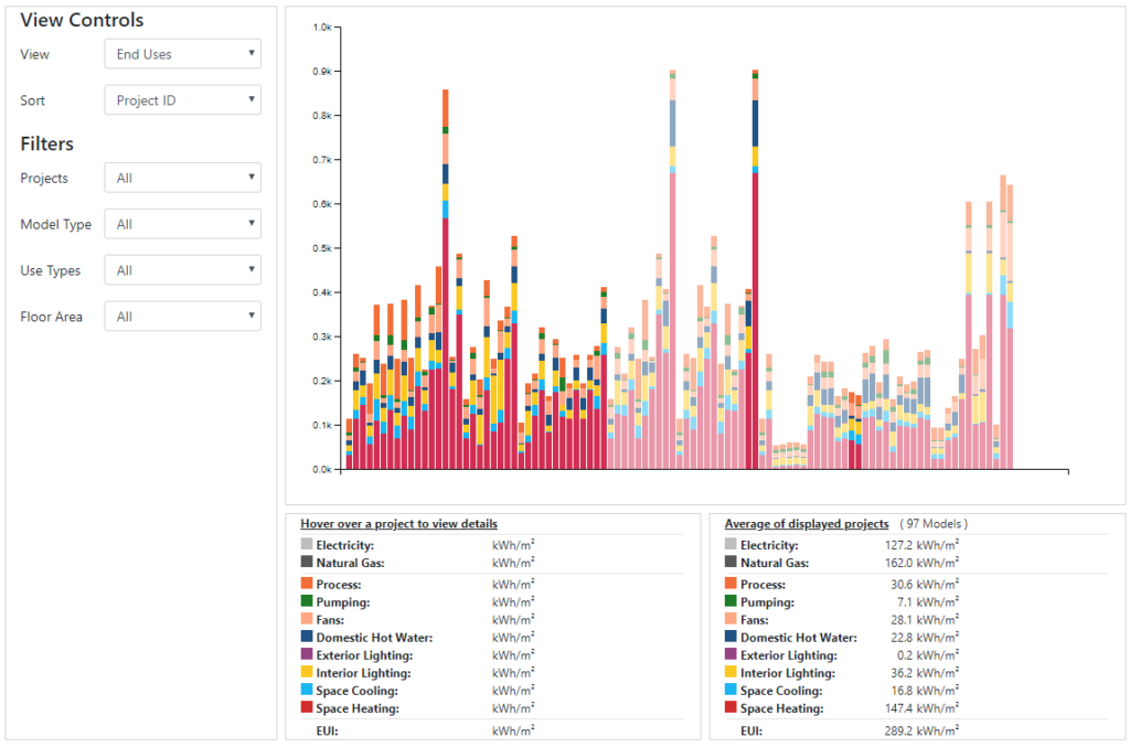
This simple yet powerful graphic provides a useful high-level overview of a project’s anticipated performance, and can be used for initial quality control reviews. For example, users can quickly query if the end-use profile of their project aligns with the general trend of a like-portfolio of projects, using the visualization filters. This can provide greater confidence of a predicted result’s accuracy or, in cases where there is not alignment, a strong point of focus to begin troubleshooting.
Bubble Chart
This is best used to zoom out and identify high-level summaries and trends across a portfolio of data. Users can once again explore their firm’s portfolio in isolation, or in the context of the larger Compass data set. In this sample graphic, each bubble represents an individual project, the size indicates the relative energy use intensity (EUI), and the colour indicates the use type. The orange dots appear consistently larger, suggesting that achieving a low EUI for an entertainment use type is perhaps more challenging than for other sectors.
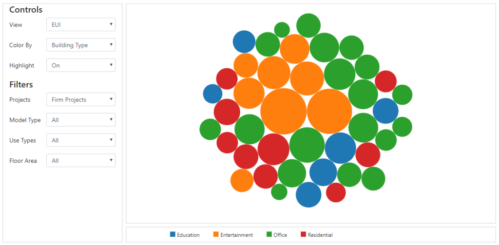
Bubble charts can also provide powerful marketing materials, allowing firms to visually express their experience with a particular building typology. As the data set expands we anticipate the bubble chart visual being used extensively for both of these purposes.
Parallel Coordinates Plot
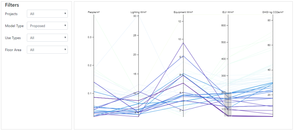
This is perhaps the visualization with the most potential power as a design aid. Individual projects are each represented by a horizontal line, and users can filter the data based on any of the variables included in vertical bars. In the image below, projects with an EUI of less than 200 kWh/m2 have been highlighted. Users can then look at trends in a portfolio of projects that achieved this design objective, exploring what design characteristics may be most important. As the Compass data set grows, users can begin to draw conclusions about the trends that are beginning to emerge.
At the close of the beta test period, 100% of the participants who completed the feedback survey reported that they would continue to use the tool into the future. The survey also provided feedback regarding where to focus development efforts between now and the public launch. Accordingly, and in order of priority, over the next several months the development team will be focusing on developing:
- More/better filtering options in the visualization tools;
- Ability to export the visualizations as images;
- Incorporation of more variables to explore;
- “How-to” YouTube videos; and
- A data export functionality.
A public launch party is set for October 2018. Although the target audience is the design community, the Compass team is excited to engage a wider audience of building review officials following the public launch.
If you or your organization is interested in a Compass training session or would like to be added to the event list for the launch party, please e-mail chris.frankowski@rwdi.com.
This guest blog was submitted by the RWDI and OAA project teams.
For more information:
- Read our previous blog on how the TAF-funded COMPASS energy benchmarking tool will help achieve deep energy and emissions reductions.
- Check out the full completion report from RWDI and the OAA.
